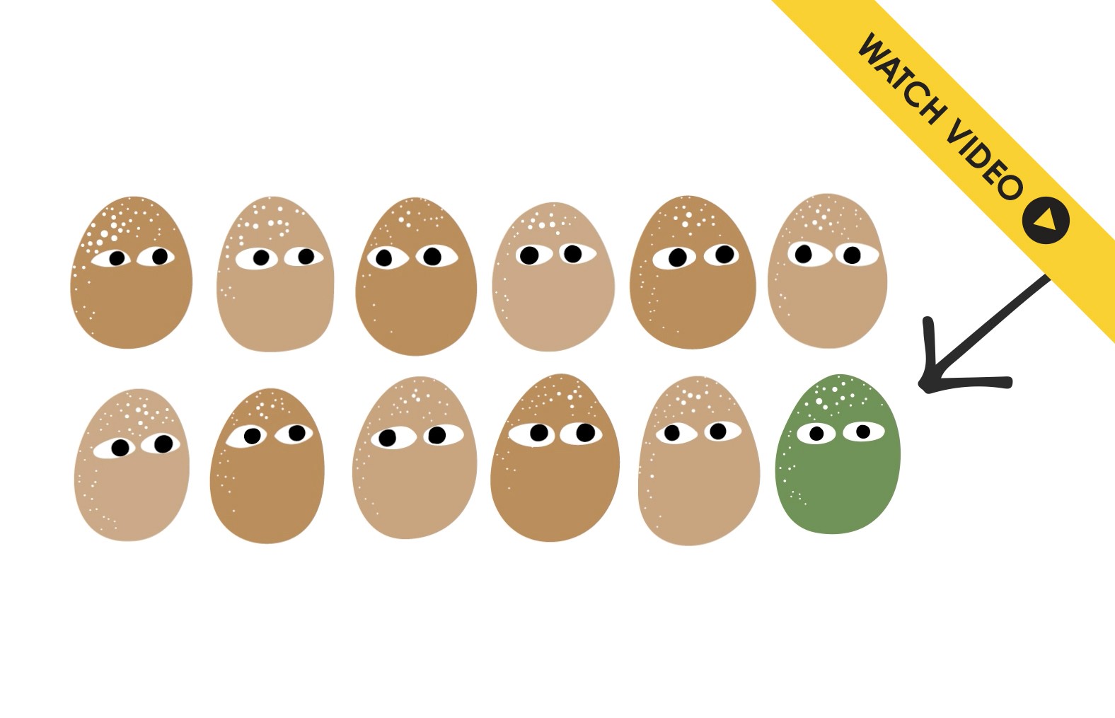

Color-blindness affects 1 in 12 men and 1 in 200 women. These people find it hard to distinguish between two colors that look very different to most people. This short explanatory video explains the project. Start watching at 1 min [total 3:38 mins].

Conventional simulators help detect problems for each of the three types of color-blindness. These pie charts show what people with each type of color-blindness see. Different color pairs are problematic for each type: colors A and B for Protan, A and D for Deutan, and A and C for Tritan.
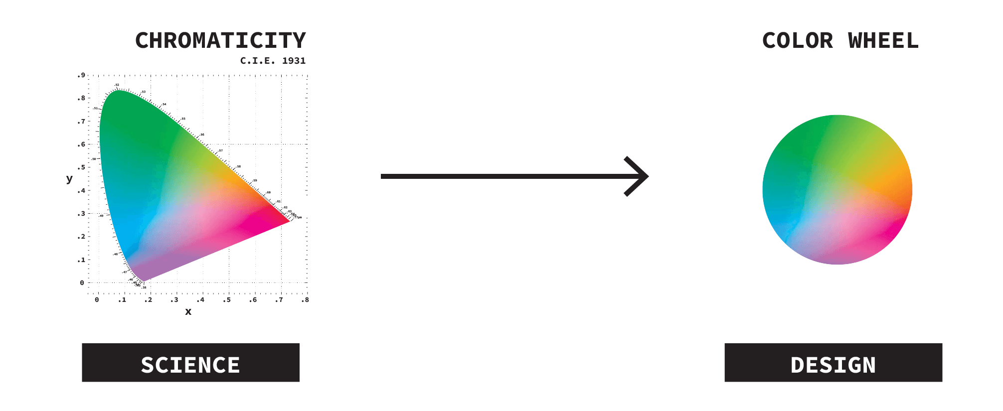
The CIE 1931 Chromaticity Diagram is used to map the range of all colors visible to the average person. Designers, however, prefer simple color wheels to pick colors.
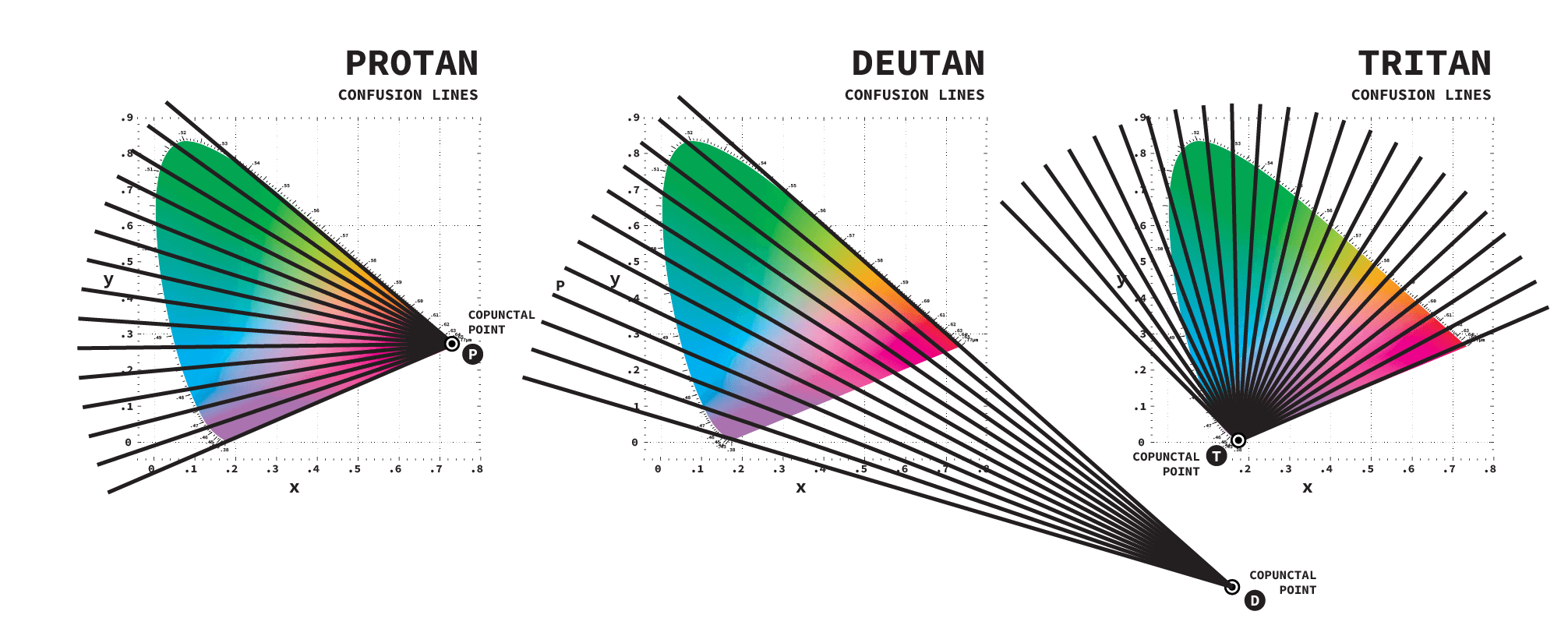
Each type of color-blindness can be represented on chromaticity diagrams as a series of black confusion lines which intersect with a copunctal point. Colors along each of these lines will look the same for people with color-blindness.
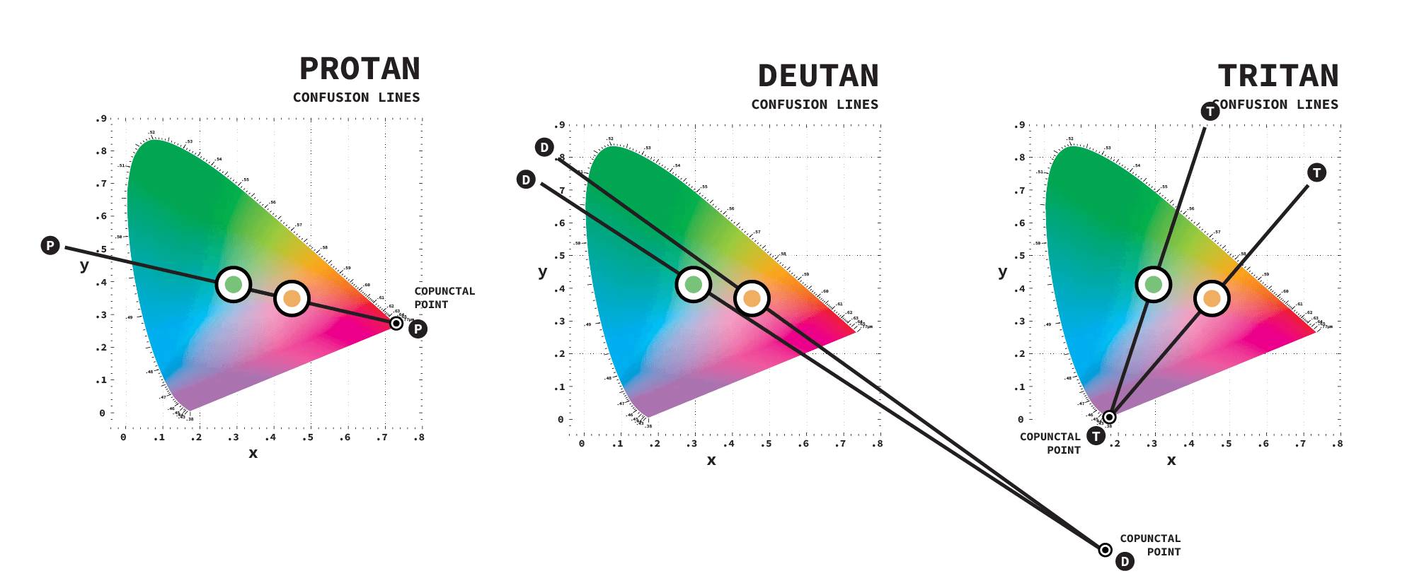
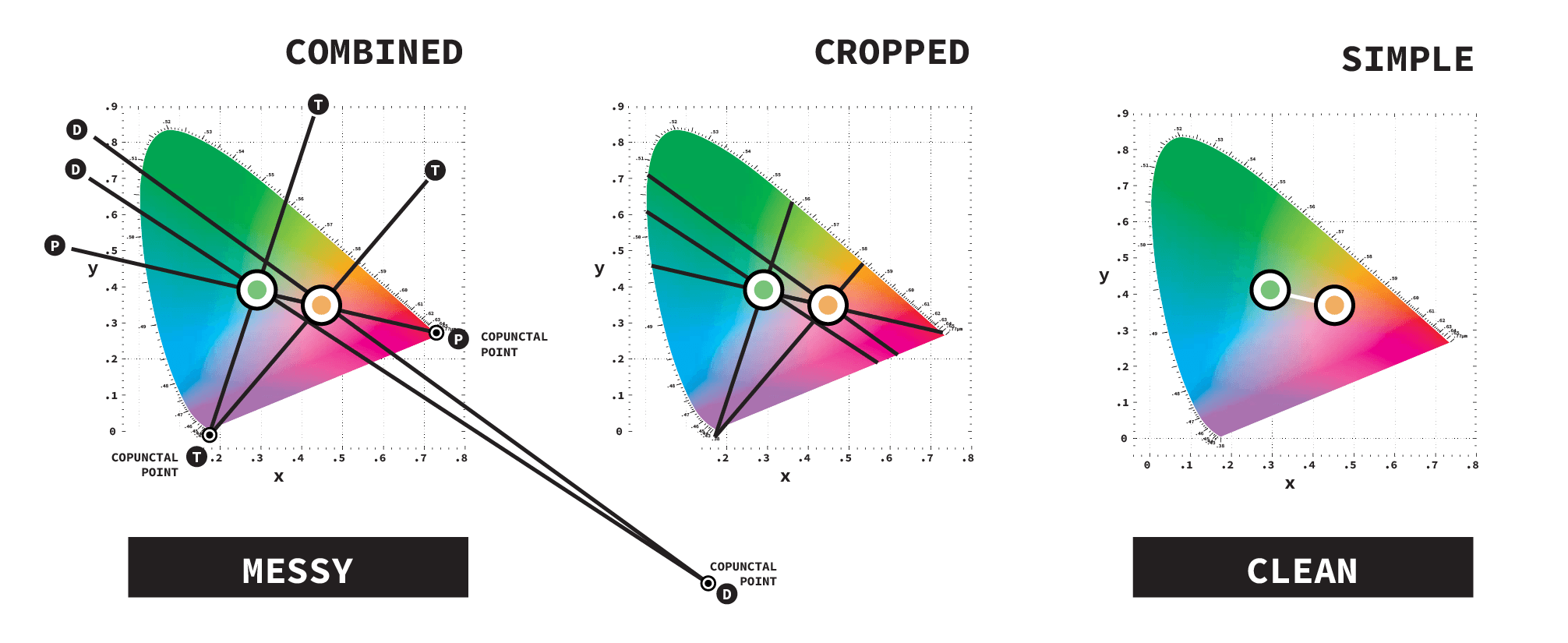
For each type of color-blindness, a set of confusion lines are drawn from different copunctal points. In the images above, Protans will confuse orange and green because they are on the same line whereas Deutans and Tritans will see green and orange distinctly because these colors sit on different confusion lines. Things get messy when confusion lines for all three types of color-blindness are combined together in one diagram. To reduce complexity, lines outside the color spectrum can be cropped. Taking it one step further, all line segments except for those between problematic color pairs can be eliminated.
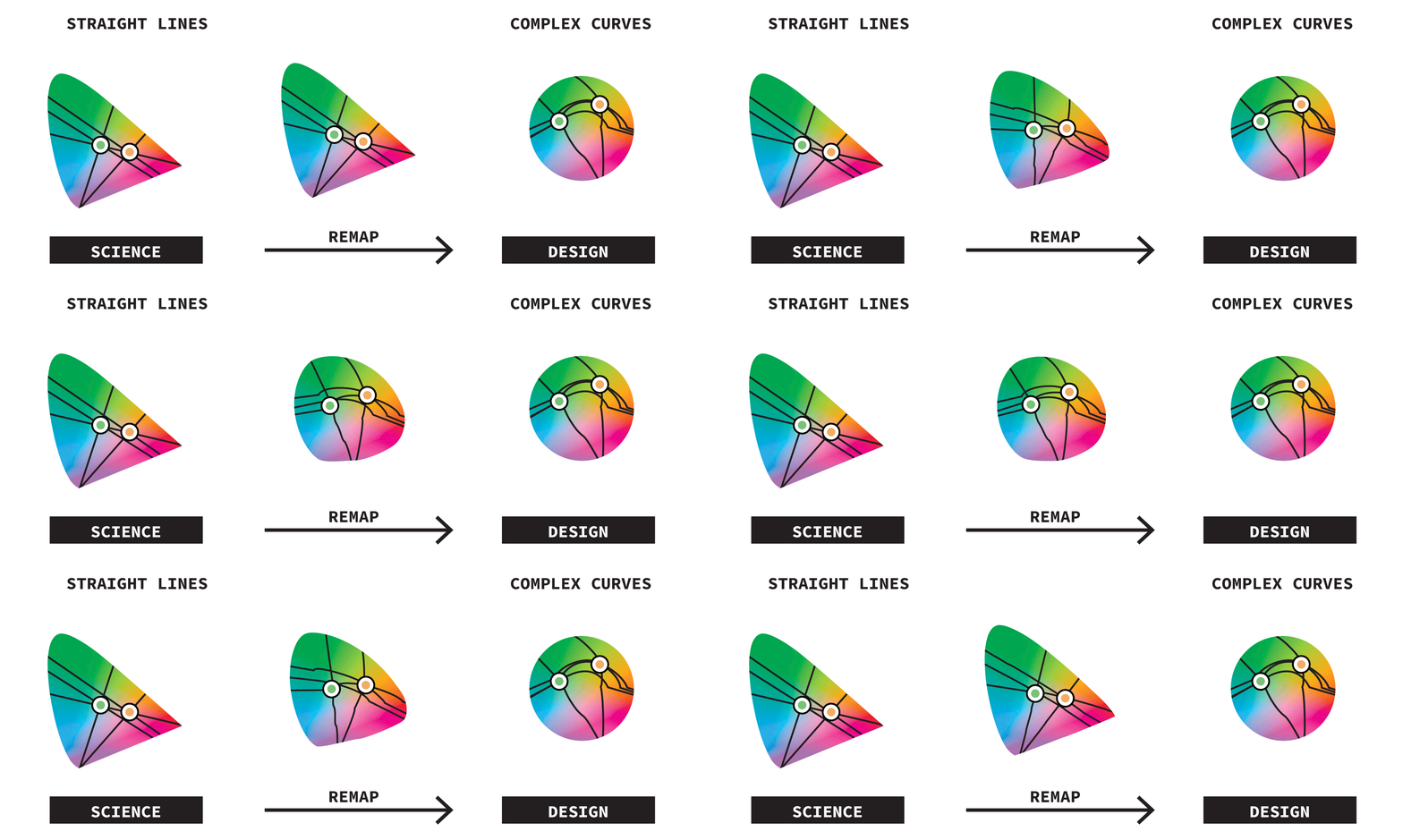
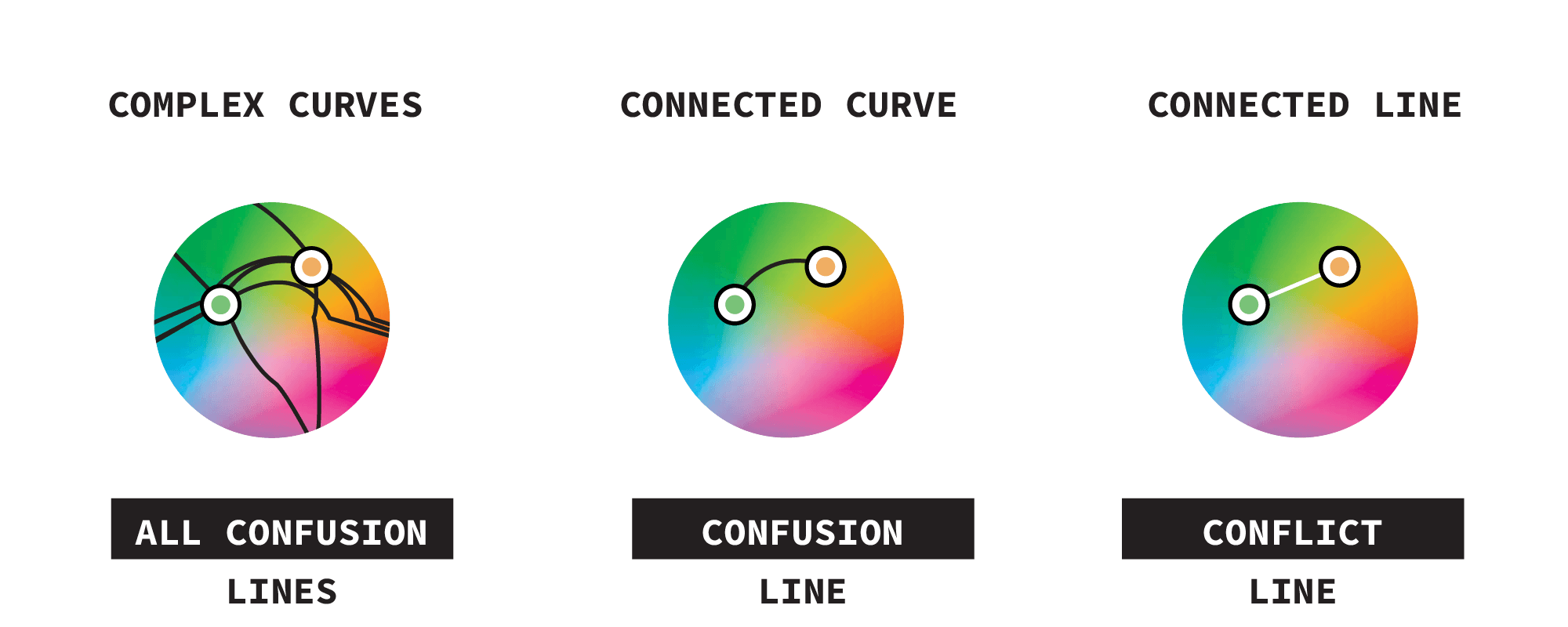
When confusion lines are remapped from a chromaticity diagram to a color wheel, it creates curved lines making the color wheel complicated and messy.
Cleaning this up again, confusion lines that do not show problems between two colors can be removed.
To simplify this more, we invented a new concept called a conflict line. This new straight line highlights any problematic color pairs.

The ultimate design solution to this new color wheel UI was similar to the simplification of the London Tube map, where the connection between stations is more important than the exact location of every tunnel. For this color wheel, knowing that there is a conflict between two colors is more important than knowing the exact location of every confusion line.

To help the Adobe Color Team build this color-picker, their requirement was to have five colors on the color wheel, again adding to the complexity of the color wheel. Conflict lines easily scaled to accommodate this.With five colors on color wheel, any problems are easily seen. No conflict lines mean no problems. If there is a conflict line, it can be eliminated quickly by dragging one of the problematic colors to a new location on the color wheel. As a color is being dragged, confusion lines for all three types of color-blindness are shown. If these confusion lines do not intersect with any other colors, the conflict line will disappear when the mouse is released.
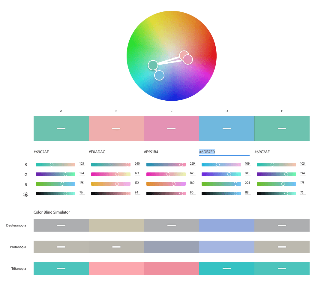
Our Color-Blind Color Picker launched on Adobe Color in 2020.
Color-Blind Color Picker
A new color picker which makes it easy to select colors that are accessible for people with all types of color vision.
Color vision deficiency
The technical term for color-blindness is color vision deficiency. Variations in the anatomy of the eye mean that everyone sees the world a little differently. People are considered to be color-blind when they cannot distinguish some colors from others. More simply put, they confuse colors. Two colors that look very different for most people can look identical for color-blind people.
Detect and correct
Selecting good color combinations is hard enough. Making sure that these colors are accessible to all creates an additional challenge. Picking accessible colors is a two-part problem: first the problem must be detected, and then a way to correct it has to be found. Detection is easy because simulation techniques are well known and there are plenty of color-blind simulator tools available. But correcting the problem has always been trial and error. Until now.
Color science to the rescue
The three common types of color vision deficiency are Protan, Deutan and Tritan. They can each be modeled as a set of confusion lines on top of color space diagrams. On the C.I.E. 1931 Chromaticity Diagram, these appear as straight lines. Any two colors sitting on a particular confusion line will be difficult for color-blind people to distinguish.
Design to the rescue
Color wheels are a standard way to pick colors. Unfortunately, confusion lines become a tangled mess of spaghetti when mapped onto color wheels. Each color has three confusion lines radiating from it, one for each type of color-blindness.
The design solution is to show a single straight white conflict line between any two colors that lie along a confusion line so that any color pairs with problems can be seen at a glance.
Confusion lines are only visible when a color is dragged around the color wheel. If its confusion lines do not intersect with any other colors, there will be no conflict lines shown when the mouse is released. No conflict lines means no problems.
Now live on Adobe Color
This color picker was initially conceived and built as one part of Project Lincoln because accessible colors are critical for good data visualizations. Putting it directly inside the app made the iterative process of picking and adjusting colors fast and seamless. The Adobe Color team wanted to bring this capability to the web, to a much bigger audience, so this Color-Blind Color Picker is now available to everyone on Adobe Color.
Award
Bringing Accessibility Factors Into Color Creation. Fast Company: best user experiences of 2020, finalist.